Insurtech web app development guide – here’s what you are missing
If you are planning a new insurtech web app, stop now and read this!
Below are the answers to the important questions you face. This advice will guide you towards a fast, intuitive, easy-to-use app that provides the frictionless user experience customers expect.
Which is best – native mobile apps or a web app?
A native mobile app is installed directly on your smartphone and usually works with no internet connection. Native apps are built specifically for a phone’s operating system – Android or IOS (iPhone), meaning that an app developed for iOS won’t work on an Android phone. Consequently, they are more expensive to develop and maintain as you have two rather than one app.
A web app is usually online only, works via your smartphone, tablet or PC web browser, but requires internet connection to work. They are generally cheaper to build than native apps as you only have 1 version to build and manage.
| Web aps | Native Apps | |
|---|---|---|
| How many versions | 1 | 2 (Android and IOS) |
| Time to market | Short | Longer |
| Reach | Excellent – any device with a browser | Limited to specific mobile devices |
| Works offline | No (unless PWA) | Maybe, but not often in insurance |
| Desktop shortcut icon | No (unless PWA) | Yes |
| Updates | Automatic | Through app store |
| Development cost | $ | $$$ |
The route you choose – web or native, depends on your end goal.
Most insurance apps provide quotes or allow users to take out a policy online, so are one-time use only, meaning that a web app will do the job perfectly.
Essential aspects of an insurtech web app
1. Ultra-intuitive interfaces your granny could handle
The best fintech apps are so intuitive, users barely needs to think to use them. This means ultra-simple navigation, simple wording and clear call-to-actions. There should be no (or at worst case) a minimal learning curve for your app. As world-renowned usability expert, Jakob Nielsen put it: “Users spend most of their time on other sites. This means that users prefer your site to work the same way as all the other sites they already know.”
Finance is hard enough to understand without having to work out how to use your app. Keep your app consistent with comparable apps and websites. We feel better if we face familiar paths, so keeping inline with other insurtech apps rather than reinventing the wheel, flattens the learning curve.

2. Remove jargon
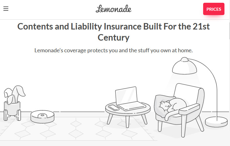
In an industry notorious for long and complicated words, insurance apps like Lemonade do a great job of using everyday words that make insurance simple.

3. Use complementary graphics and micro-animations to replace words
N26’s banking app uses sweet little pictures to soften the process and compliment what is actually going on.

If a picture is worth a thousand words, you can use simple graphic and micro-animations to reinforce what is written on screen, and even replace unnecessary texts.
4. Your app should be frictionless
Everything about your app should be intuitive and easy. Users should breeze through every step without encountering confusing choices or roadblocks. This means:
- Keep forms short to the absolute necessary – only ask for information if it is 100% required by law or for processing.
- Remove all distractions such as push notifications and marketing popups from your app. They create confusion and force the user into unnecessary work and extra choices.
- Use lookup and autocomplete on addresses and bank accounts details. This saves on typing, and avoids having to get up to find their bank details.
- Make your process 100% online. Video selfies for facial recognition and digital signatures on policies are a game-changer in insurance as they allow customers to take out a policy without getting out of bed. Bye bye appointments and queues.
- Before launching your app, let new users test it. This should reveal any stumbling blocks. Google Analytics tags are also an effective way to track users through each stage of your app and reveal blockages.
5. Remove as many choices as possible
When creating an insurance web app, it is tempting to show users all the great possibilities you offer – “they’ll love all of our great services and options… right?”
Maybe not. Users think they want all the options in the world, until they get them. Faced with too many choices, users get stuck and confused. This leads to excessive thinking and a reduction in conversion rate.
The truth is that people are irresistibly drawn to the easiest option.
Conclusion
We are lucky to live in a time when insurance is stepping away from the monotonous and confusing world of industry jargon and information overload. APIs and technology have obliterated borders and barriers and offer the chance to take insurance to a whole new level.
Ease, convenience, speed and simplicity are rewriting the history of insurtech.
