Insurance Landing Page Design – a Complete Guide
Our comprehensive guide to insurance landing page design explains everything you need to know to create the perfect landing page. We focus on the important elements of a well-built page, including design, colour, calls-to-action, psychology, social proof and form design.
Table of contents
Background
A landing page is is a specialised web page that aims to sell a product, service or procure a lead. The page can be standalone or part of a website. They are often simpler than a standard webpage with no external links, as they only have one option to the user: lead generation or making a sale.
A good landing page has carefully written copy designed to convince a customer of the product’s value.
Visitors usually reach the landing page having clicked a social media post, an e-mail marketing campaign, a PPC advertising such as Google Ads or directly from Google search.
If the goal is lead generation, the landing page will have a contact form. If the goal is sales, the page will usually have a Buy now button.
By tracking visitors and monitoring in-page events such as scrolls and clicks, marketers can run A/B tests to determine the success of an advertisement and make adjustments to optimise the landing page conversion rate.
Terminology
- Above the fold refers to the part of a webpage that is immediately visible without scrolling down. This area is different if you view a page from phone, tablet or computer. In marketing, above-the-fold content is fundamental as it is the first thing the visitor sees and your chance to get them hooked!
- A call-to-action button is a usually large button placed in a prominent position on the insurance landing page typically taking the form of an instruction or directive, for example, “Buy now” or “Sign up”. The objective of your insurance landing page is to maximise clicks on the call-to-action button.
- Click-through-rate (CTR) is a marketing term to measure the success of a landing page or advertising campaign. CTR is the percentage of landing page visits that result in a click on the CTA button. The higher the click-through-rate, the greater the success of the campaign.
- A/B testing or split testing is a marketing research technique. In a simple A/B test two slightly different landing pages are built. Usually one page element is changed for each test, such as a call to action text or button colour. After a certain length of time, results are compared to see which page performed best.
- Landing page optimisation is the process of systematically improving landing pages to maximise the conversion rate. This is achieved through monitoring in-page analytics, collecting user feedback, and A/B testing.
- Conversion rate optimisation (CRO) is the process of maximising the percentage of users who take a specific action (usually passing on their personal details or making purchase).
Page layout
Your insurance landing page should have one goal (a click on the call-to-action): so remove everything that distracts the user from reaching that goal.
Remove the following from your page:
- Navigation menu. You want users to stay on the page, so remove all links to external pages, including your navigation menu. You can keep a homepage link on your logo.
- Footer. Keep a simplified footer with only the required legal information, your contact details and links to social media profiles for confirmation of who you are.
- Irrelevant images, buttons and widgets. Remove all elements unrelated to the landing page. This includes widgets and buttons that are not part of the CTA.
- Advertisements and banners. Remember, an insurance landing page has one goal, advertisements and references to other products or websites confuse and distract users from that goal.
Before

- Cluttered landing page
- Too many links – the nav menu draws users to other pages
- The Contact and Account buttons reduce the impact of the CTA button
After
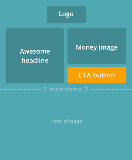
- Distraction-free landing page
- Clear message
- Clear goal
Long form layout
This landing page study for Protalus found that a long page format increased sales by 58%.
Instead of a small page packed with information, they designed a very long page. Simple at the top, with more detail as the user scrolls down. Each sub-section is designed to answer a question, dispel a doubt, or promote the product from a different angle.
Above-the-fold
Web users are fickle. Studies have shown, from the moment a user arrives on your page, you have 5 seconds to convince them to stay. In those 5 seconds, you need to show that you can give them what they want.
Above-the-fold content (what the user can see without scrolling down) needs to be clear and convincing. Don’t make the user scroll down to find what they want.
Before

- Key information is off-screen
- CTA hidden below-the-fold
- User forced to scroll
After

- Key information is immediately visible
- CTA above the fold
- No scrolling necessary
Money shot
A picture tells a thousand words.
Cliché or not, all effective landing pages have a great big product image: the shoe you are buying, the phone all your friends have, your next holiday destination.
Insurance is slightly different! The product is not a physical object but a legal promise. You don’t want to include a picture of the contract on your insurance landing page! Insurers get around this by using warming, emotional images of the hypothetical insured.
In our study, leading insurance landing pages all had images with the following characteristics.
Insurance customers want a product they relate to
The image must relate to the insurance cover – the family hugging on the couch (family insurance), grandma with her grand children (life insurance), a family holidaying (travel insurance)
Bad

- A boring stock image
- Detached and lacking empathy
- Very low conversion rate
Good
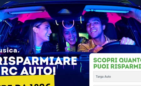
- Positive and fun
- The customer can relate to this image
- Real people in a real car
Warm, positive images convert better
Warm and empathic images with a positive message have been proven to increase conversion rates.
Negative image

- Negative message
- Client far less likely to buy
Positive image
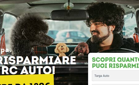
- Positive and fun, detracts from the severity of an insurance claim
- Proven to increase sales
Full screen images have greater impact
The bigger and brighter the image, the greater the impact and the stronger the message hits home. This is one of the reasons we all love cinema!
Low impact

- Small image
- Creates less emotion
Higher impact

- Full-screen image
- Creates more emotion
Clear, convincing message
You have 5 second to convince users to stay on your page. Catchy wording for your title and sub-title can skyrocket your conversion rates.
Below I have shared the secrets of compelling insurance landing page copy. Follow this advice and you will start to see your customers hook.
Don’t waste a single word
Every word should serve a purpose, so use clear and concise titles. Users don’t want to read an essay so get straight to the point.
Be persuasive
Most users will shop around on competitor sites so you must sound like the best. Use convincing copy to stand out. Catchy texts with strong (but true claims) will help you stand out.
Before
We have been insuring people since 1975Fill out our form and you could get a quote for insurance in 5 minutes. We will get back to you shortly. Try out it now you wont be disappointed
- Unclear – which insurance cover is being sold?
- Too long, uninspiring
- “5 minutes” – this mention is superfluous. Speed is a prerequisite for any online insurance quote and expected by clients.
After
Home InsuranceProtect the place where memories are made.
The UK’s MOST POPULAR home insurance
Life InsuranceGet a $250,000 life insurance policy for as little as $14 per month
Show the client what THEY get
Customers don’t want to hear how old and reliable your company is or how much you know about insurance. They want to save money AND get wider cover – so tell them that!
Before
We are the life insurance specialistsCelebrating successful years 50 years With out policy you are covered from a wide range of accidents. Click below to find out more
- Company orientated text – the customer doesn’t care
- Generic – what is actually covered?
- Dull text
After
London driversYou could save big on car insurance
or (set yourself apart)
London driversYou could save big on car insurance. Option to suspend 3 times during the year!
- Customer orientated text – tells the user what they get
- The London mention strengthens the client’s connection with the product
Pricing
Here are some excellent techniques to increase conversions, even if your insurance cost more than your rival’s.
Show a price drop or special offer
In sales perception counts. If a customer thinks they are over-paying, they will look elsewhere. However, if they feel they are getting a special deal, they are far more likely to buy.
Before

After

Put the price in context
The annual cost of an insurance policy can appear quite large at first, especially for a family on a budget. But the daily cost can almost seem insignificant – so pointing this out on your landing page will help answer your clients concern about the overall cost.
Calculate the daily cost of the insurance policy and compare it to a completely different product. Here is one of my favourite examples:
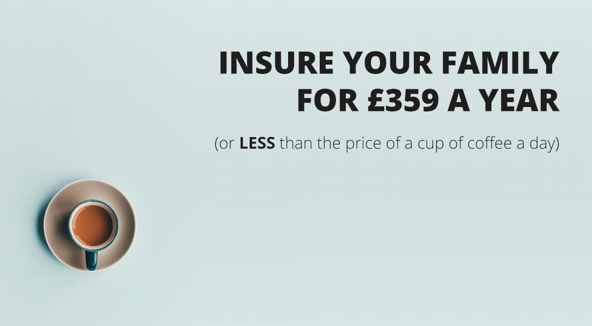
Still cost more? Point out the benefits
If your insurance costs more than competitor’s, you will need to demonstrate why you are worth it.
- Show clearly the benefits your insurance offers over your competitor’s, for example, extra cover.
- Point out the risks a customer is taking with a competitor insurance, that you provide cover for. You offer vandalism cover, but your competitors don’t – make this clear. If your travel insurance covers cancelled flights, point it out.

Call-to-action buttons
Your page should have a big, bright call-to-action button in a prominent position. Follow these tips to make your CTA super convincing:
- Make your button over-sized and bright, in a colour that contrasts well with the background. Here is a neat guide explaining the psychology of colour and conversion rates. For buttons on insurance landing pages I usually go for green (which conveys saving and growth), blue (trust and security), orange (confidence and friendliness) or dark grey (security and intelligence).
- One button above-the-fold, that can be repeated towards the bottom of the page to save users scrolling back up to the top.
- Use inspiring text that compliments what is being sold. “Buy now” or “Get a quote” are ok, but “Save on car insurance” or “Get the UK’s most popular car insurance” sound way better.
TIP: use a contrasting text to shed light on the (silly) alternative to taking insurance with you.
Bad CTAs
Effective CTAs
(no thanks, I prefer to pay more with my current insurer)
(no thanks, I want to take the risk)
Reviews and social proof
Adding customer reviews, media quotes and celebrity testimonials are proven to increase sales.
Include customer reviews above the fold
Market research specialists iPerceptions found people are 63% more likely to buy from an eCommerce site that has user reviews than one without.
Reviews should preferably be above the fold and near your CTA. We created this page shown below for an Italian insurer. The page has customer reviews and newspaper quotes from leading the national press directly under the call-to-action. A great way to win over new customers.

Media quotes
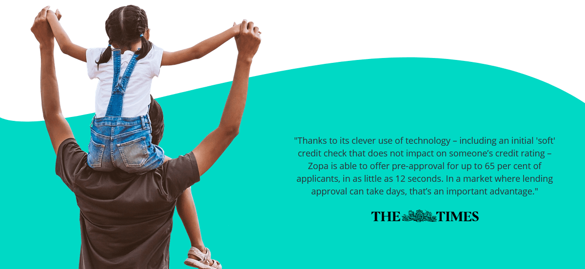
If you have featured in the media let your clients know about it. Newspaper logos on your page work well.
I love this next one – Zopa feature their most influential review with a full width banner:
Here’s another good example of social proof. Cloud Insurance showcase major clients who rely on their services:

Cake Insurance display their best customer reviews in carousel below their lead banner:

Celebrity testimonials on your landing page

Why do sports brand Nike pay an enormous sum to Maria Sharapova to endorse their brand? Celebrity testimonials work. They know an initial $100 million investment can generate billions of dollars in sales over the next decade!
You don’t have to pay 100 million to your favourite VIP, but if you could get a positive review from an influencer on your landing page, then do it.
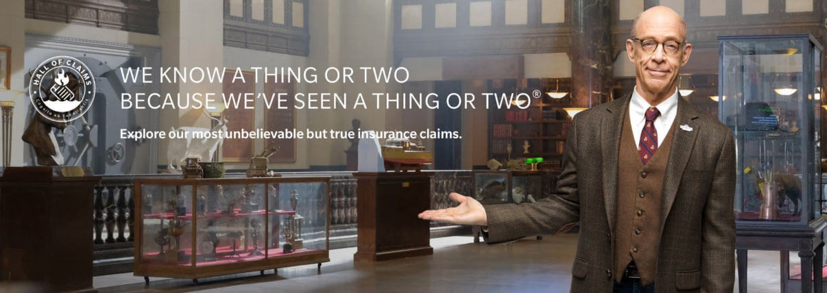
Returning to the insurance field, Hall of Claims commercials used Oscar-winning actor J.K. Simmons in their ads. Through the ads, viewers are left with the impression that the insurer has the experience and credibility to handle anything.
Supporting media
You can widen your landing page appeal by promoting your product through other forms of media. This also looks professional. For example:
- Video: some people prefer a video to reading a page. A short video is also an effective way to demonstration how your product service or page works without pages of writing. Video is popular with Gen-Z and Millennials who have grown up with smartphones, Youtube and TikTok.
- An infographic is a nice visual way to summarise your page. Clients can download, print off or share the infographic on social media.
- A downloadable PDF allows consumers to print off your marketing material and read when it is convenient.
Examples
Now the fun part! Below are examples of good insurance landing pages.
Cuvva
This is a really sleek landing page offering car insurance. It is clean, clear and to-the-point. They showcase their reviews, featured media logos, and compare their reviews to competitor’s.

Cuvva also compare their reviews to those of cherry picked competitors.

Anorak
Reviews, insurer logos, fun cartoon graphics and comprehensive information make Anorak stand out. Click Get started and the subsequent full-page sign-up is very user-friendly.

Lemonade
This page stands out as it is so different. Everyday language makes the brand seem friendly and approachable. Competitive prices, lots of reviews and social proof.
As you scroll down the page, they deal with questions and doubts a customer may have. This is important for a Insurtech Startup – questions like – “Will you still be around in 20 years?” need addressing. Lemonade have done this well.

Linear
A fun, clean landing page with a clear call to action. The page is distraction-free – the navigation menu and links have been removed to keep users on the page. On the downside, the page lacks reviews. Their homepage actually has better examples of social proof (reviews, trusted clients, payment methods).

Monzo
Not exactly insurance, but Banking App Monzo have good landing pages and great user interfaces on their apps. They have clear, persuasive copy and great product images.

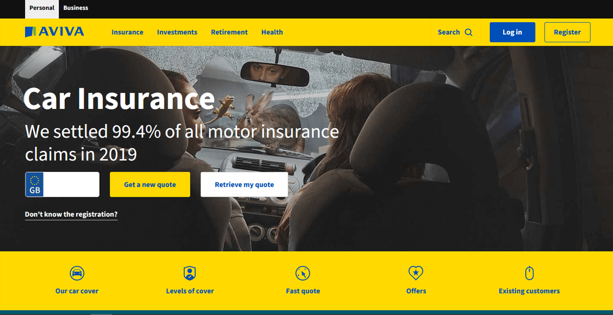
Aviva
I am not a huge fan of this page, but my colleague likes it because of the comprehensive information. The form for new and returning customers is as easy as they come (just add your car reg). There are too many external links for my liking. For example, remove the personal/business bar at the top, and the customer reviews (just out of the shot below) will become visible above the fold, and potential customers will not click through to other pages.
Bought By Many
A strong claim in the title. Reviews and awards are displayed above-the-fold.

Flock
A growing number of Insurtech Startups are entering in niche markets with few competitors. Flock have a comprehensive landing page for drone insurance.


